Overview
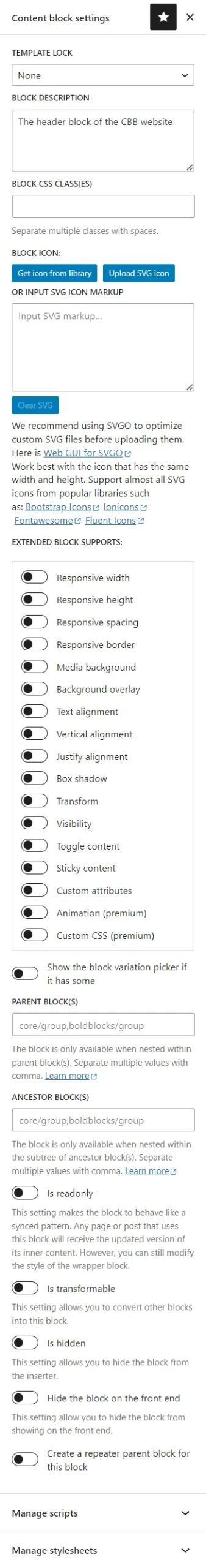
The block edit screen has a Content block settings section in the sidebar on the right side of your screen. This is where you can adjust the important settings of the block. If you don’t see the sidebar on the right, click the Settings icon in the top right corner to open it. If you want to focus only on the Content block settings section, click the Plugin icon or the Content block settings menu item in the More Options menu. You can toggle the more options menu by clicking the three-dot menu on the top right.
Adjust settings for stand-alone blocks
This guide only covers how to input these settings. To learn what these settings mean, please go to the basic and advanced sections of the Custom Blocks guide.
Synced block overrides: Toggle the synced block overrides control to turn on synced & overrides mode
Template lock: Choose from one of the following values: None, All, Insert, or Content Only.
Block description: Input a short text to describe the block.
Block CSS class(es): Input additional CSS class(es) for the block.
Block icon: You can input a custom icon for your block by:
- Click the Get icon from library button and find an icon from the built-in icon library
- Click the Upload SVG icon to upload a custom SVG image.
- Paste an SVG markup directly in the textbox.
The SVG image should have the same width and height. The recommended size is 24px for both dimensions.
Extended block supports: You can choose whether to enable or disable extended support features for your block by toggling on/off these controls.
For the Custom Attributes feature, you can define custom attributes (CSS variable or dataset attribute) for your block when you enable it. You will see a section called Block Custom Attributes below the Extended Block Supports section where you can enter the custom attributes. If you want to add custom attributes where you use the block, you can turn on the Enable creating new attributes control. The supported data types are: Text, Number, Boolean, Unit, Color, Background, Image, Video, JSON, Label
Show the block variation picker if it has some: Toggle on this control to display the variation picker popup. This popup will only appear if the block has at least two variations.
Parent block(s): Input one or more block types here. Use a comma to separate multiple values. Ex. core/group,boldblocks/group
Ancestor block(s): Input one or more block types here. Use a comma to separate multiple values. Ex. core/group,boldblocks/group
Is transformable: Toggle on this control to allow transforming other blocks into this block.
Is hidden: Toggle on this control to turn on the hidden mode.
Hide block on the front end: Toggle on this control to hide the block from displaying on the front end.
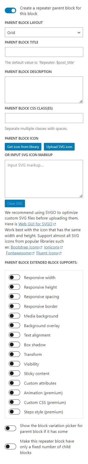
Create a repeater parent block for this block: Toggle on this control to create a parent block for this block. You will see a list of settings for the parent block appear below this control. Learn to input attributes and settings for the parent block in the below section.
Adjust settings for repeater parent blocks
When you enable the repeater parent block option, you will see a list of settings for this parent block. These settings are similar to the ones for the child block. You should visit the guide for these settings before you start inputting them.
Parent block layout: Choose from one of the following values: Grid, Carousel, Accordion, or Vertical stack (default).
Parent block title: Input the title for the parent block.
Parent block description: Input a short text to describe the parent block.
Parent block CSS class(es): Input additional CSS class(es) for the parent block.
Parent block icon: You can input a custom icon for the parent block similar to the child block’s.
Parent block extended block supports: This setting is similar to the one for the child block. However, you should keep in mind that the parent block and the child block have different lists of extended block support features, and each list varies depending on the block layout.
Show the block variation picker for the parent block if it has some: Toggle on this control to display the variation picker popup. This popup will only appear if the parent block has at least two variations.
Make this repeater block have only a fixed number of child blocks: Toggle on this setting will display a setting called Number of child blocks for you to input a number. The default value is 1.
Restrict the child block so that it’s only available as a nested block of this repeater block: You will see this setting only if the parent block layout is Vertical Stack. If this setting is off, then you can use the child block as a stand-alone block or as a child block of the parent block. For other layouts, the child block is always a direct child of the parent block. You cannot use it as a stand-alone block.
Change log
- The read-only mode becomes the synced block overrides since version 2.6.0